MARKETING / DESIGN SYSTEMS | 2023-2024
Email Design System
At eBay, we prioritized effective brand marketing through intricately crafted emails. Since 2020, our custom email modules have grown into a dedicated Figma library, leading us to establish a specialized eBay Email Design System. As a designer on the Creative Studio team, I contributed to maintaining this system by documenting elements, creating Figma components, developing new modules aligned with the eBay Design System, and ensuring dark mode compatibility.
This page highlights the foundation, component structure, Figma tips and tricks, and our documentation process.
By merging product and marketing design together, we had to find a way to utilize existing brand colors, typography, and iconography, while creating new grid systems.
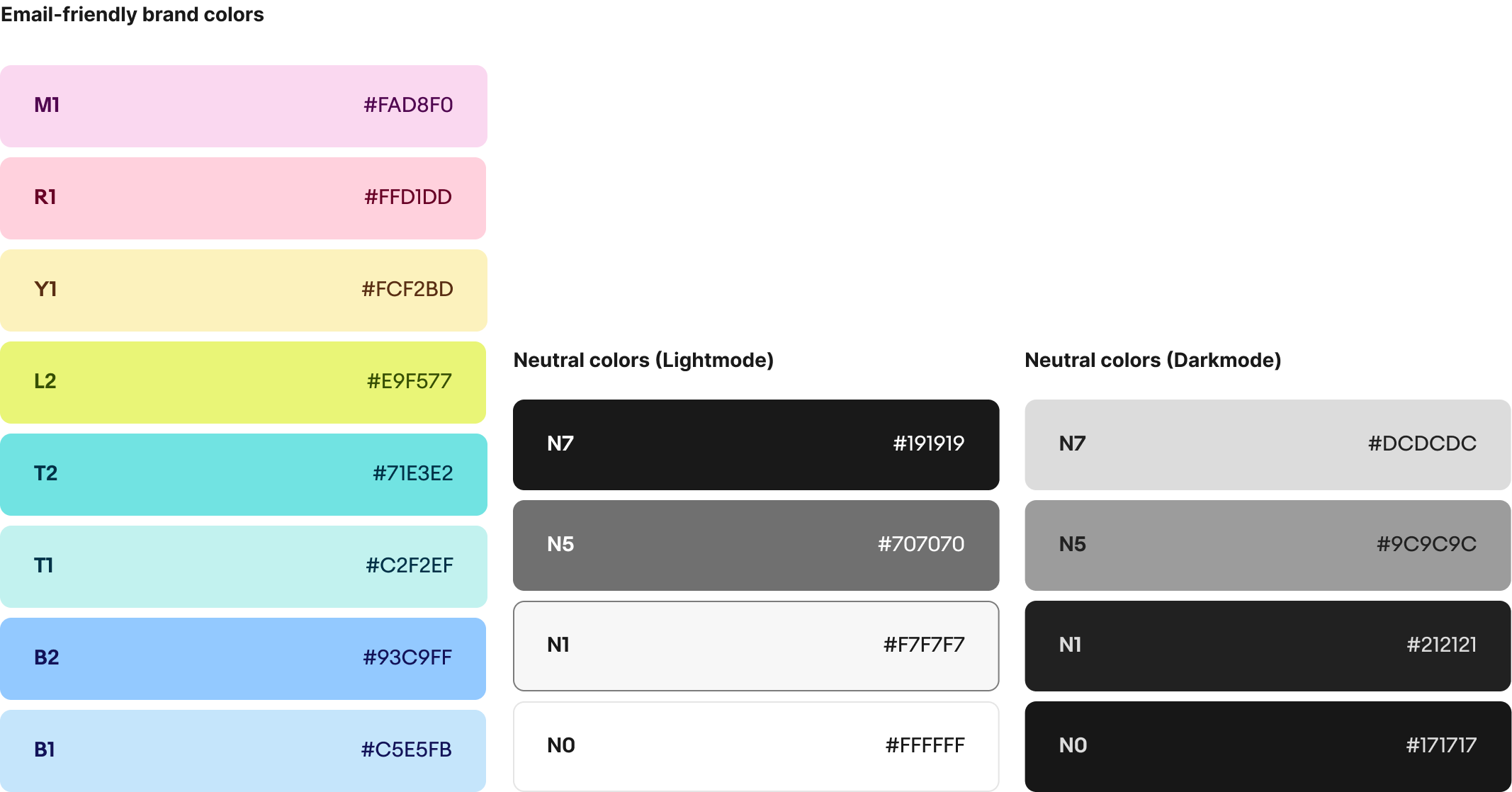
For color, we took the time to test which brand colors worked well for email platforms, taking into consideration how different colors performed on Gmail, Outlook, & Apple mail. Darkmode performance was also considered, which narrowed down the inital marketing palette into those presented on the right. We also integrated the neutral greys used in the palette, making sure to include the darkmode variants in each component.
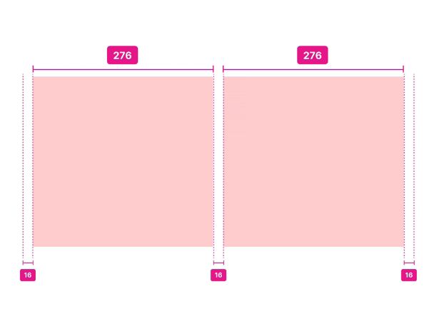
For the grid system, we aligned with a 8pt system that was scalable across the different types of grids for both desktop and mobile. For Desktop, we utilize a 2, 3, and 4-column grid across all types of email communications, and across all modules.
To scale that down for responsiveness in mobile, we utilized a single column and a 2-column grid, which helps smoothly stack content when scaling from desktop to mobile.
Every module is surrounded by 16px margins on the left and right. There is also 16px padding between columns on desktop, and 8px padding between columns on mobile.
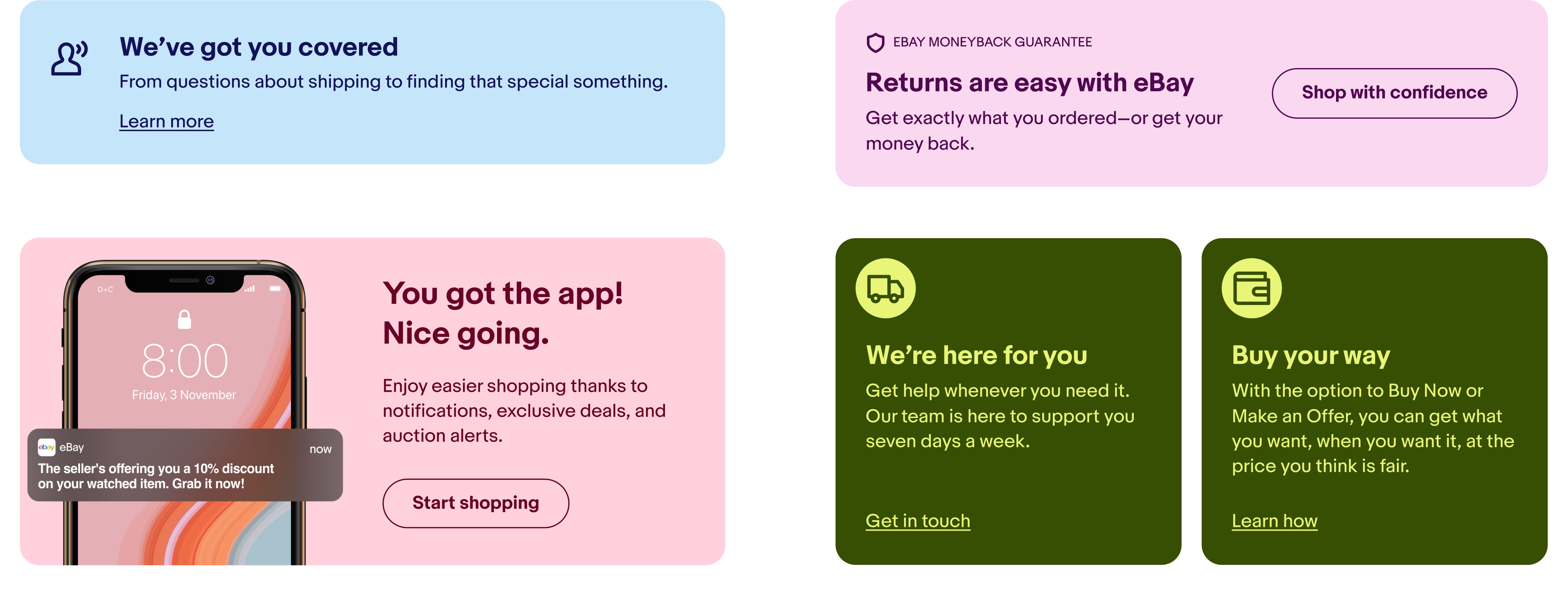
We use the iconic eBay typeface 'Market Sans' in our email modules. The bold weight is used solely for headlines, where the regular weight is used for body and legal copy. The eBay Design System also houses a multitude of icons to use across the brand. When using them in email, we contain them in a circle to ensure visibility across light and darkmode platform switches.
The goal with this library is to make sure every designer and developer that uses this system can easily switch through every component as easily as they can. Each email component built on Figma is customly built to house as many Figma tools as possible.
By clicking a few options, you can seamlessly switch a component to its mobile version, to a light/dark mode version, and view grid and effect styles.
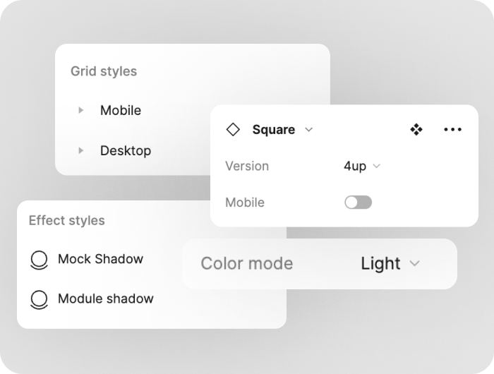
Recognizing each Figma user has their own levels of software familarity is key, so setting up a how-to page at the start of the documentation page allows Figma users adapt to what they need with the email library.
With Auto Layout, each component is also responsive. It allows for designers and developers to use multiple breakpoints for mobile without having to detach the component and manually scale each element.
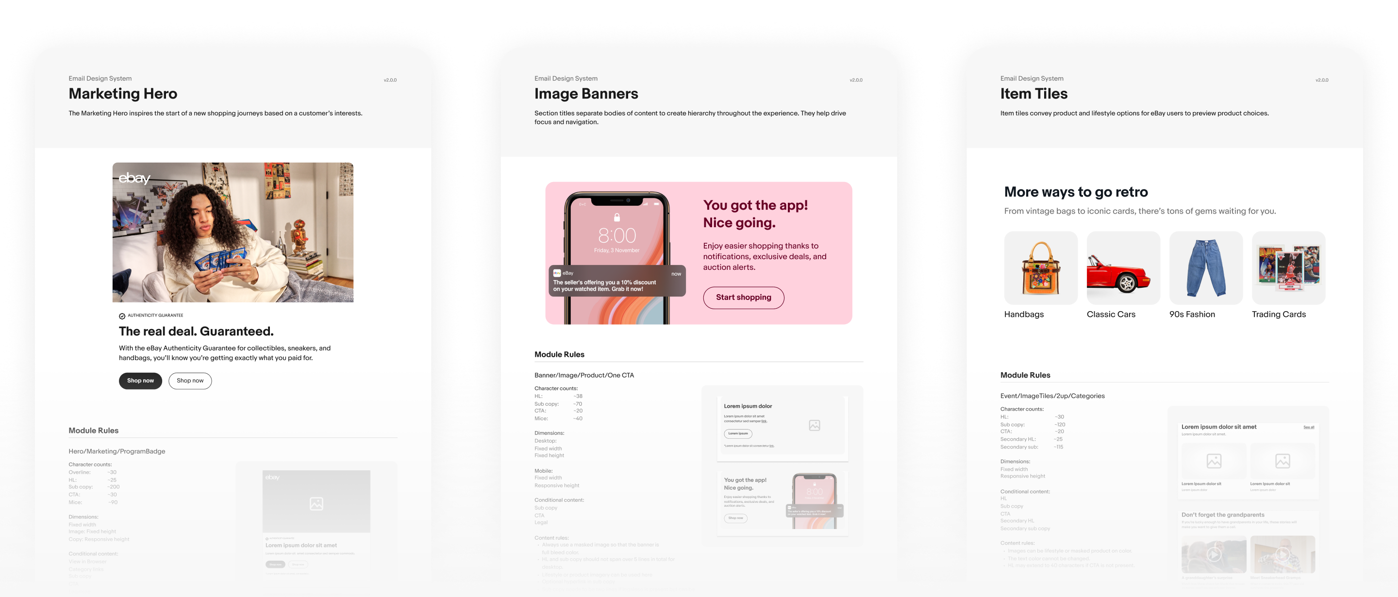
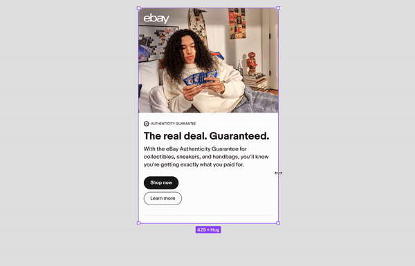
Each component in the Email Design System is carefully documented with specs, character counts for copy, image size, do's and don'ts, and best practices. We wanted to make sure that each person that goes through the documentation sees how exactly they can use it, and answer any initial questions they have. We also put aside a visual example of each component in the documentation so that designers can see how it looks like in its bare state, and how it looks like populated with content.